Hi,
I'm Amanda Makieła


My story
I am a UX/UI designer with experience in leading projects and developing the area of consumer research. In my work, I focus on user research and design thinking. I am looking for non-obvious solutions and I believe that every project should combine functionality and beauty.
My projects
My first project is an app for furniture company Gotuj Wygodnie

How it started?
This project started with the e-mail from furniture company owner. His business is focused around website that allow users to design and order custom kitchen furniture. The main way of communication that user has was through filling long and complicated forms.
The main problem of the customer was his concern about high number of potential clients leaving the page before order completion. Users were frustrated with too long and complicated forms. Customer requested form and general user flow redesign.

Know thy user
Who is the user?
Target group consists of:
customers with a rich wallet
40-55 year-olds
residents of the city over 300 thousand inhabitants
customers demanding in terms of quality and service, busy and without time
people who have recently renovated the kitchen and bought custom-made furniture
the main decision-makers in the selection of a furniture company and ordering furniture
people from outside the IT and furniture industry
Interviews and conclusions
Course of the interview:
1. explanation of the purpose of the study and the course of interview
2. warm-up questions - small talk
3. relevant questions:
Where do you start changing the arrangement of your kitchen?
Do you remember your last furniture purchases? What did you notice? What kind of shop were you in? What did you like about that purchase process?
What does the purchasing process usually look like, starting from the decision to change the kitchen furniture to placing an order?
When you think about looking for new furniture, what are you afraid of? What causes stress? What discourages you from taking action?
Do you remember buying furniture that has not been finalized? Do you remember why the purchase did not take place then?
In-depth interviews
I started researching users during interviews and made personas based on assumptions that were appearing after analysis of interviews.


Personas

I created two personas based on existing knowledge about the target audience

Personas helped me identify the behavioral patterns of a target user but also ensure a strong relationship with the audience by invoking empathy. I referred to them throughout the entire product development process.
Starting the design
After interviews and gathering knowledge about users I started designing process.
I created paper and lo-fi digital wireframes.


Usability studies
I invited 4 persons to take partake in usability studies. During these studies participants were asked to complete 4 tasks. Studies confirmed part of earlier findings and also gave some new insights.
Round 1 findings:
1. App is easy to use
2. Route user have to follow to complete tasks is generally intuitional
3. Actions can be finished fast and without hesitation
Round 2 findings:
1. Users want to have access to various forms of support
2. Forms have to be as simplified as possible
3. Some minor visibility changes have to be done to quicken the order completion process.
Recommendations
Additional accessibility research, especially with inclusion users with disabilities and other underrepresented groups.
Larger scope of usability studies
A/B tests of previous and updated versions of prototype to research correctness of changes
Unmoderated usability studies can be conducted to recruit more participants and test prototypes without interviewer influence and guidance
Mockups
After usability studies I created hi-fi mockups based on my findings.


High-fidelity
prototype
Accessibility considerations
After testing usability now was the time for also consider accessibility of my project. These are the steps I took to bring considerations to life:
App was redesigned to be easier to read and visually accessible.
Navigation between project making steps is intuitive thanks to breadcrumbs, hints and more detailed informations.
More options to quickly reach support from professionals are added.
Forms are short and simple to fill.
Takeaways & next steps
Impact
Usability studies gave the the opportunity to look at project through another persons eyes and changed assumptions. Some findings were a surprise, some confirmed doubts that arose during the ideation phase. All findings are useful and will make the final product more usable, more pleasant and quick to interact with.
What I learned
I learned that some assumptions can be misleading and user needs can take surprising routes. Small design decisions can have large impact on final product and user needs should always be reconsider and put first through whole designing process.
Step one:
I aim to conduct more usability studies - especially including larger and more differential participants groups.
Step two:
I want to gather more information through A/B testing of prototypes.
Step three:
Unmoderated usability testing can also expand my understanding of how to make design process more on point and final product even more user friendly and usable.
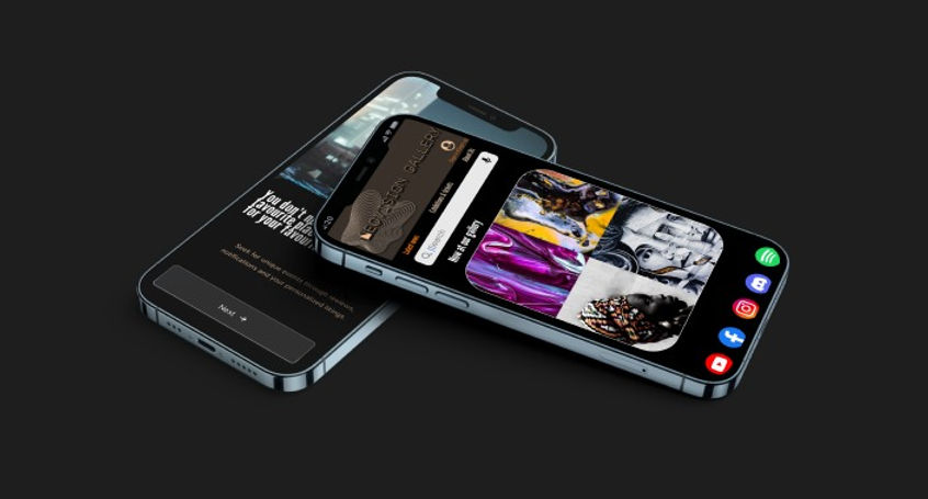
Second project
My second project is an app for art gallery. It will give users access to virtual visits on exhibitions without leaving home. It will also allow to buy tickets fast and easy.
The goal is to make app as accessible as possible, improve prototype and erase things that were problematic for users during usability tests. Also I want to develop further things that were seen as useful - like preview of gallery exhibitions and simple and fast registration process.
User research
pain points
Time
Users don’t have enough time for traditional visit in art gallery. App will give them access to many exhibitions.
Money
Users don’t have enough money for physical travel and visit. Visiting in app will be cheaper than traditional tours.
Security
Users feels insecure and anxious before investing money and time in visit. App will allow them to browse gallery contents before buying a ticket
Accessibility
Users don’t want to be forced to leave their current place to make long travel. App will grant access to visit exhibitions globally, without geographical borders.
Personas
After the interviews and analysis of data I created personas to better understand users.

User journey maps
During creating user journey maps I noticed that main problem for users will be having enough time and money for traveling and visiting galleries. My app will grant them opportunity to avoid that problems and also provide unique and modern way to access art.


Main goal for users is to avoid anxiety and worries consisting of need to find time, reschedule their activities and find funds for visit in gallery. The app should boost their curiosity and let them avoid frustrations.


Usability study: findings
I invited 5 persons to take partake in usability studies. During these studies participants were asked to complete 4 tasks. Studies confirmed part of earlier findings and also gave some new insights.
Round 1 findings
App is easy to use
Route user have to follow to complete tasks is generally intuitional
Actions can be finished fast and without hesitation
Round 2 findings
Users want to have access to various forms of payment
Registration/login have to be as simplified as possible
Some minor visibility changes have to be done to quicken the ticket buying process.
Recommendations
A/B tests of previous and updated versions of prototype to research correctness of changes
Additional accessibility research with more detailed usability studies, especially with inclusion users with disabilities and other underrepresented groups.
Updated digital wireframes
Usability studies pointed what can be done to make app more useful and intuitive. The wireframes and prototype were updated according to these findings. These changes were meant to make each task be easier and quicker to finish by the users.


Mockups

Studies revealed that landing page need to be redesigned to be more readable, more clear and visually appealing.
Steps that leads to buying a ticket were redesigned according to laws of good design - high contrast, clear messages and easy to follow actions.


Login and register screens are more readable and easier to understand.
Accessibility considerations
More payment methods to choose from were added.
The users can now buy tickets without need to register/login.
Preview of available exhibitions and more details about them are added.
Link to virtual visit is more visible and accessible now.
Desktop mockup


Takeaways
Impact:
Usability studies gave the the opportunity to better empathize with users and challenged assumptions. Points made by participants during studies proved to be surprising and useful during refining and making the final product more usable.
What I learned:
I learned that user ways of interaction can dismiss any assumptions. Design decisions can always be challenged by user needs.
Next steps
More usability studies can be helpful with refining the final product.
I want to gather more information through A/B testing of prototypes.
Unmoderated usability studies can also provide more useful data that will help make project even more user friendly.
Third project
My project is an app for used items give away. It will provide users access to platform that help give away items that they don’t use any longer but wants to share with those in need. It will also allow an easy and safe way to communicate with other users.
.png)
The problem:
People interested in ecology need easy and free way to give away used items. Those in need a place where they can search for things that are listed for free.
The goal:
The goal is to make accessible app for used items. App should include preview of listed items and simple and fast registration process. App is aiming to save time and money of users and allow users to list and search for items without leaving home.
User research: summary
I started researching users during interviews and made personas based on assumptions that were appearing after analysing the interviews.
Main user group will be those interested in ecology, sustainability and reuse of various items and those who search for free items.Users will belong to age range of 20-70 years old. Research confirmed assumptions that users want to save time and money, avoid paid listing and want fast and easy access to second-hand things. App will help share things between users, promote empathy and ecological thinking and also give those in need access to free items.
Pain points
Time
Working adults and students don’t have enough time to look for someone in need for specific items by themselves. App will help them give away things quickly and without obligations.
Money
Users don’t have enough money to meet their needs. App will help them find things for free.
Comfort
Users have limited time and resources to look for specific items. App will allow them to browse ads without leaving their home.
Ecology
Users don’t want to be forced to leave their current location to travel long distances. App will grant access to visit exhibitions globally, without time constraints and geographical borders.
Persona: Regina

Problem statement:
Regina is a busy educator who needs to have access to listings via app
because she wants to reach people in need and share items quickly and for free.
Persona: Daniel

Problem statement:
Daniel is a retired nurse who needs to have access to used furniture via app
because he wants to pursue his hobby and have no time to leave his house to seek for used things.
Now is the time to put knowledge into motion
Paper wireframes
Paper wireframes allowed me to further expand ideas and prototype observations from interviews.


Usability study: findings
I invited 6 persons to take partake in usability studies. During these studies participants were asked to complete 4 tasks. Studies confirmed part of earlier findings and also gave some new insights.
Round 1 findings
App is easy to use
Route user have to follow to complete tasks is generally intuitional
Actions can be finished fast and without problems
Round 2 findings
Users want to stay as anonymous as possible
Browsing ads have to be made as simple as possible
Some minor visibility changes have to be done to quicken the listing process.
Recommendations
A/B tests of previous and updated versions of prototype to research correctness of changes
More extensive accessibility research with inclusion users with disabilities and other underrepresented groups
Unmoderated usability studies can be conducted
Usability studies with a larger scope


Refining
the design


Accessibility considerations
Content is grouped in easy to browse categories.
The users can now easily choose which personal information they provide.
Preview of newest ads is accessible from main screen now.
Listing items demands only few fields to fill and allow personalized communication options.
Responsive designs

Takeaways
Impact:
Interviews and research have confirmed that the designer's product vision often misses the user's expectations.
What I learned:
In the design process, you can't take anything for granted and things that seem obvious to the designer can be incomprehensible and oppressive to the user.
Next steps
More expanded usability studies may be needed to ensure the quality and usefulness of final product.
Prototypes should be studied in more detailed way during A/B testing.
Unmoderated usability tests will help gather additional data.
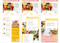
Fourth project
My project is a website for dietitian. It will allow users to contact professional help and schedule an online consultations. It will also help them choose and customize their personalized diet plan.

The problem
The users problem relates to need for professional help and general lack of time to compose their own diet.
The goal
The goal is to make website as usable as possible and give users easy and fast access to services provided by my client.
Understanding
the user
I started researching users during interviews and made personas based on assumptions that were appearing after analysis of interviews.
Main user group will be interested in healthy lifestyle, busy, active and open for changes and newest trends. Users will belong to age range of 20-45 years old. They want to save time and be sure that their diet advisor is a professional. They want fast and easy access to various services.
Pain points
Users don’t have enough time for traditional visit in nutrition clinic. Website will give them access to services online.
Users don’t have professional knowledge about nutrition. Website will help them contact with qualified nutrition expert.
Users feels insecure and anxious before investing in diet plan. Website will allow them to browse various diets before choosing one.
Users want to feel that their diet plan is fully personalized and meets their unique needs. Website will allow them to consult diet menus with professional.
Personas
Persona: Linda
Problem statement:
Linda is a busy marketing expert who needs to have access to professional dietitian via website
because she wants to leave important decisions to qualified nutritionist.


Persona: Jacob
Problem statement:
Jacob is a social worker who needs to have access to nutritionist via website
because he wants to be in touch with professional that will understand his unique needs.
User journey maps
During creating user journey maps I noticed that main problem for users will be having enough time and money for traveling and visiting clinics. My website will grant them opportunity to avoid that problems and also provide easy and fast way to contact dietitian. Main goal for users is to avoid anxiety and worries - finding time, rescheduling their activities and find funds for visit in clinic. The website should boost their curiosity and let them avoid frustrations.

Starting the design
Paper wireframes
I started the design process by visualizing ideas and observations from interviews on paper.


Testing the design
Usability study
I invited 5 persons to take partake in usability studies. During these studies participants were asked to complete 6 tasks. Studies confirmed part of earlier findings and also gave some new insights.
Round 1 findings
Website is readable and intuitional
Informations are easy to find
Actions can be finished fast
Round 2 findings
Users want to access detailed information before investing in diet
Some visual elements are little confusing and should be redesigned
Process of scheduling a consultation and choosing diet plan is fast and easy enough
Recommendations
Additional studies
Accessibility research should be conducted, especially with inclusion users with disabilities and other underrepresented groups.
Unmoderated usability studies
Studies with larger scope of participants should help reconsider design choices.
A/B tests
Previous and updated versions of prototype should be conducted to test correctness of changes
Refining the design
Tests have mainly shown the need to visually change some elements of the page. The new layout is more readable and dynamic, it is to distinguish elements that are important and facilitate navigation for the user.
 |  |  |
|---|---|---|
 |
Accessibility considerations
General visual redesign have been made - content is more readable and organized.
More detailed preview of diet plans is now available.
Users can now browse more reviews before choosing a service they need.
Payment flow is more simple and various payment methods are accessible now.
Takeaways
Impact
Usability studies gave the the opportunity to look at project through another persons eyes and changed assumptions. Some findings were a surprise, some confirmed doubts that arose during the ideation phase. All findings are useful and will make the final product more usable, more pleasant and quick to interact with.
What I learned
I learned that some assumptions can be misleading and user needs can take surprising routes. Small design decisions can have large impact on final product and user needs should always be reconsider and put first through whole designing process.
Next steps
I aim to conduct more usability studies - especially including larger and more differential participants groups.
I want to gather more information through A/B testing of prototypes.
Unmoderated usability testing can also expand my understanding of how to make design process more on point and final product even more user friendly and usable.
Fifth project
WalkPals app
My product is an app that allows users to connect with other dog owners, plan activities together and share interests.
Project duration:
02/11/2022 - 29/12/2022

Project overview
The problem:
Dog caretakers want to connect with other animal lovers from nearby are to share walks and fun activities.
The goal:
The goal is to create digital product that will help users find friends with mutual interests and plan activities together.
Know the user
User research: summary
I conducted 12 in-depth interviews with dog caretakers. Interviews consisted of 11 questions:
Where you are living?
How old are you?
What kind of work do you do?
Do you use some mobile applications?
How often do you walk your dog?
Do you walking your dog by yourself? If yes - do you walk your dog alone?
Do you know other dog caretakers?
Do you want to know other dog owners?
Which sports/activities you do with your dog?
Do you know any mobile application or website that help dog owners meet each other?
Do you think there’s a need for such application?
Key insights derived from the interviews:
Dog owners generally think that they don’t spend enough time with their dogs
They want walks to be fun and special
Those that are training their dogs and play dogsports are more willing to meet new people
Many participants think that meeting other dogwalkers will be a good idea and will add quality to their walks
Participants don’t know any mobile application for doglovers
Potential users think that there’s a need for application dedicated to meeting new people that are living nearby and have similar hobbies
User research: pain points
Loneliness
Dog caretakers like to have a way to let their pets to play with other animals and they want to find new friends also for themselves.
Busy life
Busy people don’t have time and opportunity to connect with other dog lovers.
Communication
Users want to have a secure and easy way to make connection with new friends.
Sharing hobbies
Users want to meet new people with similar interest - dogs, dog sports and training. In this way they can learn from other caretakers and develop their interest.
Personas

Persona: Ann
Problem statement:
Ann is a busy teacher who needs to make time that she spends with her dog special because she have little time.
Persona: John
Problem statement:
John is an engineer who needs friends only with similar interest because he has an active lifestyle.


Starting the design
Paper wireframes
In first phase of design process I created paper wireframes. After making corrections in them I moved on to designing high fidelity wireframes in Figma.


What I learned
Usability study: findings
Users suggested that filtering potential friends by interest will be convenient
Users want a way to share walk stories with others
App need to have personalization options to be more appealing and engaging
Addressing user needs
During usability tests, users generally found the application to be clear, legible and interesting. However, there were suggestions on how the existing options could be improved or what else they would expect. Agreeing with these suggestions, I redesigned some options, and created others from scratch.


Accessibility is the key
Without considering accessibility problems and introducing changes that will allow as many users as possible to use the application easily and pleasantly, even the best design will become cumbersome and useless. Therefore, I spent a lot of time to consider potential problems that users may encounter and applied the design to prevent them.
The colors are vivid and high contrast is applied.
The font is clear and legible, and the spacing is large.
The design is minimalistic, devoid of unnecessary frills, which makes the application useful and easy to navigate.
Takeaways
Impact:
Working on this project has convinced me that the most important step in the design process is to clearly pose the problem we are trying to solve.
What I learned:
To think about problem, not a solution. It’s important to spend time understanding the pain points and needs of users.